User testing / UI
Highspeedinternet.com
Shopping for internet
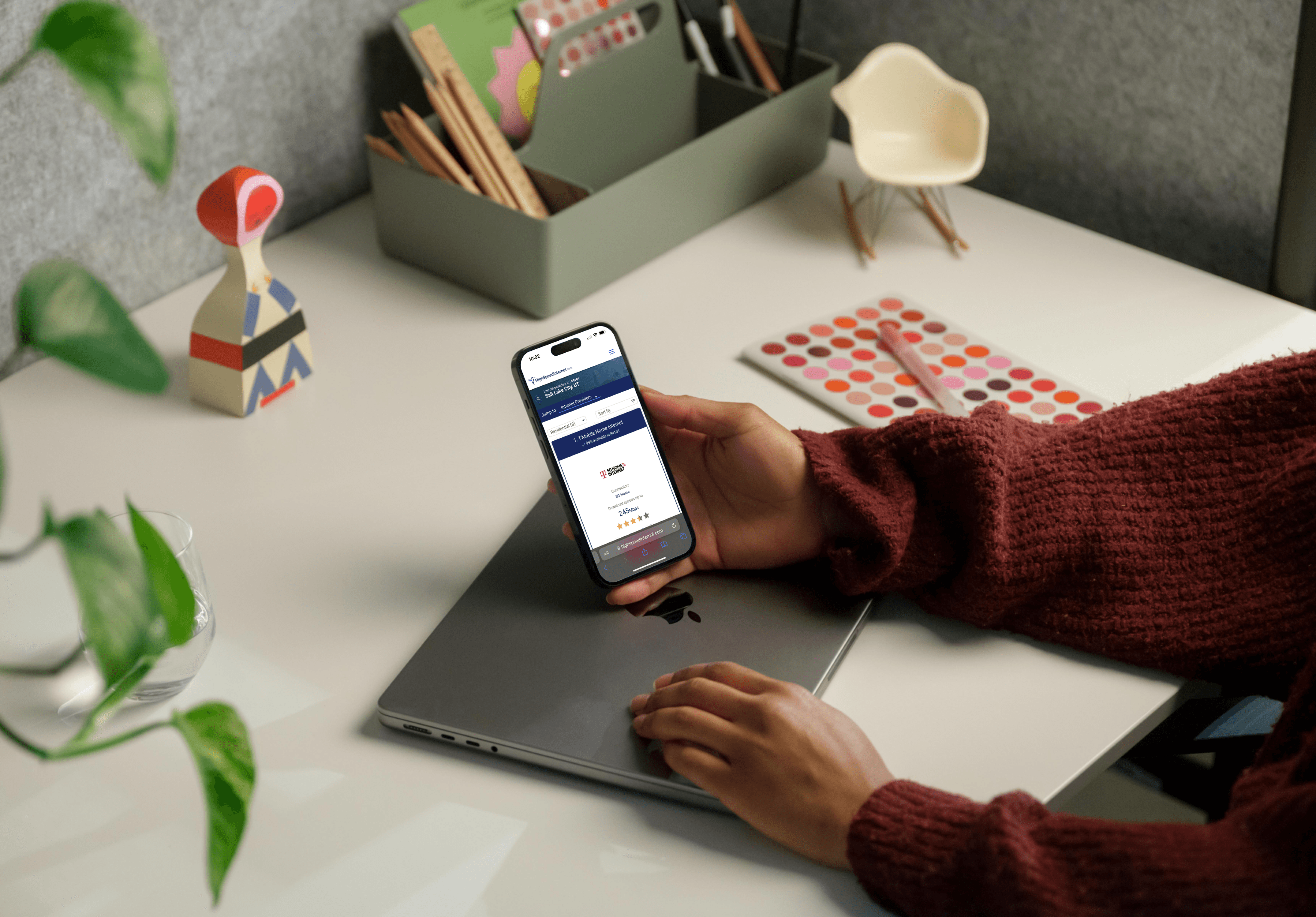
Even as a leader in the space, generating tens of millions in yearly revenue over recent years, our team at Highspeedinternet.com set out on a user-testing journey to discover insights from shoppers. After reviewing hours of user testing videos and participating in follow-up team workshops, I prototyped and presented new page and product card designs to improve our buying experience.

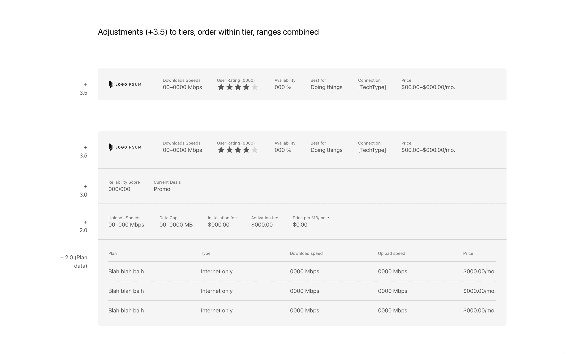
Low-res product card, showing collapsed and expanded states, with informational heirarchy based on team workshop.
Vision
On Highspeedinternet.com, one of the key ways shoppers find internet options in their area is by finding their way onto a zip or city-level geo page. Customers primarily come to these pages in two ways: by clicking directly into the page through a geo-specific search on Google (i.e., “internet provider in my area”) or by entering their zip code somewhere within the site itself. Once on these pages, we show the customer a series of product cards filtered by geographic region.
One of the significant problems we observed when customers came to our geo pages was their experience of clicking back and forth from our site to service provider websites (what we called “ping-ponging”), trying to find the exact information they were looking for to make a purchase. On top of that, the experience from one provider’s site to another can be drastically different.
Our team wanted to create a better shopping experience where customers didn’t need to switch between sites while maintaining a simple and well-organized product card—to give the customer exactly the right amount of information they needed to feel confident in their purchasing decision.

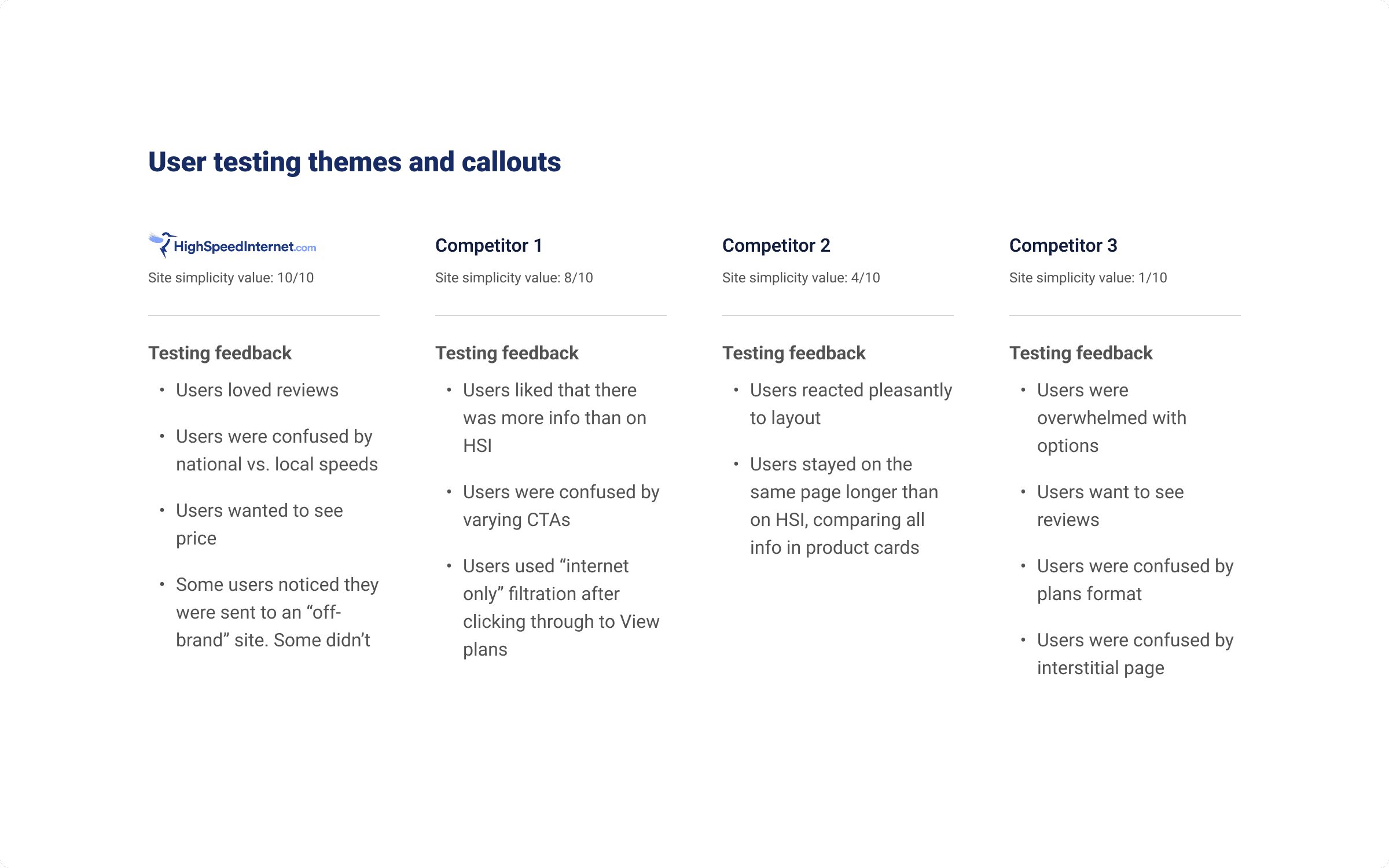
User feedback summary from our user testing research.
Process
To improve our experience, we utilized a user testing platform and asked testers to describe their experience using our website vs. their experience using one of our competitor’s websites while their screen was recorded. Each tester described their thought process as they worked through a standard shopping experience. Our team sorted and grouped these insights into a rainbow spreadsheet for follow-up discussions.
After watching all user feedback and participating in team card sorting workshops, I broke down page and product card elements into categories of importance and used weighted team scores to build a hierarchy of elements.

Elements and optional properties categorized by importance.
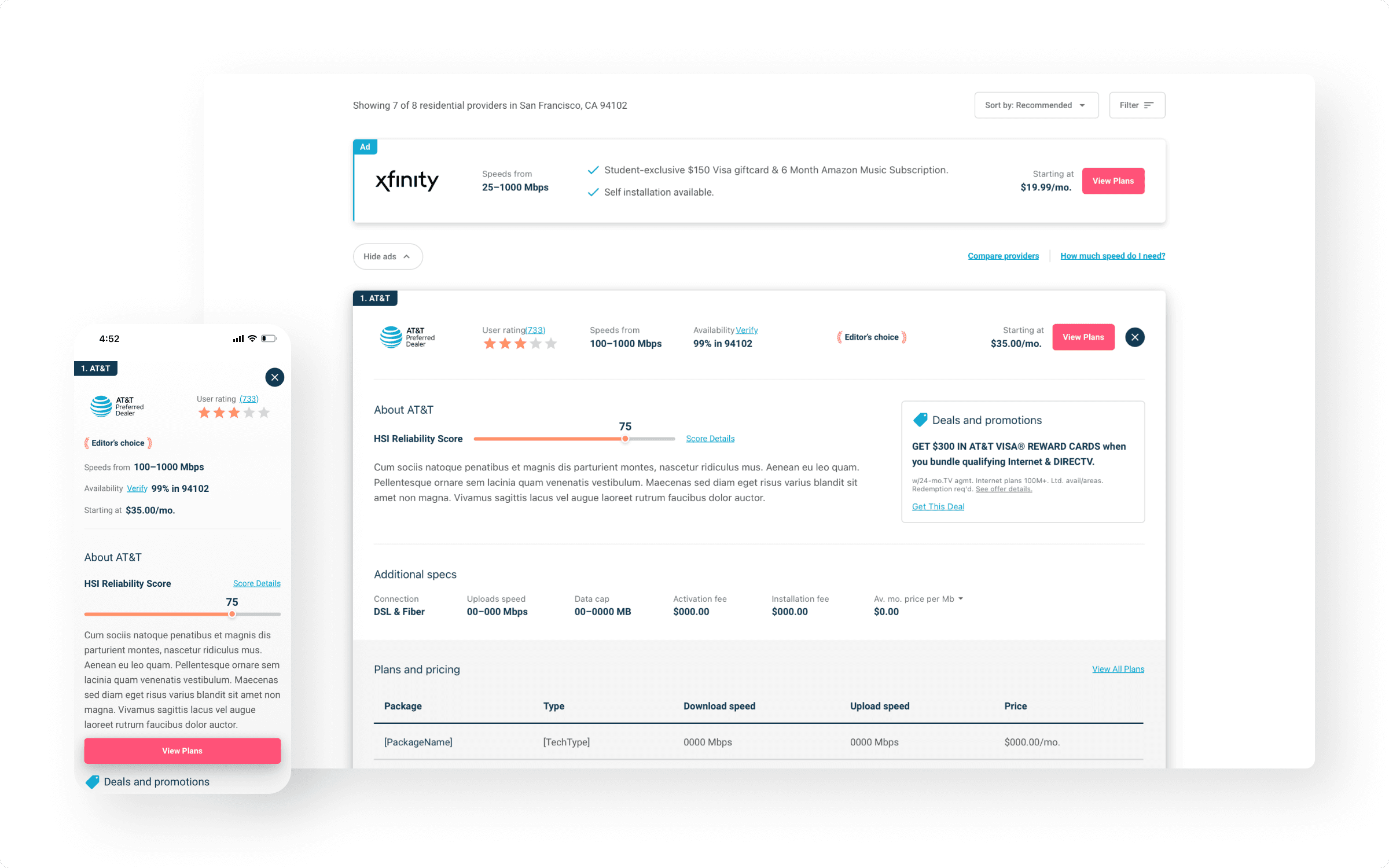
I used all of the research from our user testing and workshops to build and present a new series of low and high-resolution design prototypes. These prototypes for a new product card and geo page template experience were then handed off to engineering to be built and tested to measure performance against the existing page and cards.

Hi-res concept of product card.
Summary
The user testing I went through was extremely helpful in understanding how our site matched up to competitors and gave our team insights and perspectives that we, as site contributors, might otherwise have a hard time recognizing. I took the insights we gained to create new ideas for the types of experiences customers on our site might have. The experience from research, through user testing, into design and beyond, helped me gain a new appreciation for our website as I worked towards creating a better and more improved customer experience.
