
Branding / UI
Highspeedinternet.com
Rebranding an industry leader
Clearlink acquired Highspeedinternet.com in the early 2010s. When I was brought on to lead design in 2018, the site was starting its rise towards the top of the internet shopping space—however, in its decade of life, the site had become a visual hodgepodge of different ideas, and the brand needed a fresh take. I helped direct the effort to redefine the site’s identity—redesigning the brand’s logo, creating a brand style guide, and working with contributors to update and refine web styles and processes, helping the site build and maintain its position as a leader in the space.

Before and after of the Highspeedinternet.com logo.
Vision
The sites growing success made a complete brand overhaul feel unnecessary and a potential risk to leadership. Instead, I started working to refresh the existing branding and to build a cohesive identity that the team could work towards over the coming months, hoping to elevate and compliment the quality of the content and tools offered on the website.
Process
Discussions around the site’s name and logo started with a debate about how the site was internally referred to as “HSI” and how that had mistakenly been allowed to be used in branding. I successfully pitched returning the logo back to a full-name domain reference and started working on an updated hummingbird icon and logo.

Logo section hero for the brand style guide, showing the new Highspeedinternet.com hummingbird icon.
Color
With a new logo decided on, I worked on a color palette update, shifting to more accessible blues and focusing on being more intentional with our use of the updated primary action color. Additionally, I consolidated a broad and inconsistent web palette into a more narrow set of colors to be used on the site—while simultaneously building out an extended complementary palette of yellows, purples, and greens for illustration and social imagery.
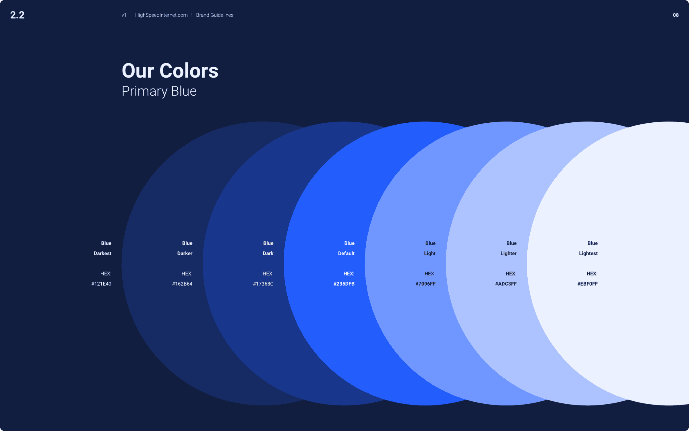
Color palette design from the brand style guide.
Type
To simplify the typographic system, I worked with the lead engineer on the site to consolidate what had been a chaotic mess of hierarchy and styles into a single typeface with a minimal hierarchical structure. This choice allowed a lean contributing team to focus less on design and tech drift and more on improving the overall product.
Imagery
Imagery had been a constant issue for the site. With no clear style direction, content contributors used whatever they could get their hands on. I worked to align visual categories and example libraries with the site’s content verticals, helping contributors see and understand how lifestyle imagery worked with the content to deliver a cohesive message to customers.
Additionally, I worked with the branding director and illustrator to help define visual styles for the site’s imagery and illustration. Together, the work we put together helped give a unique feel to the website’s visual assets.

Illustration example from brand style guide.
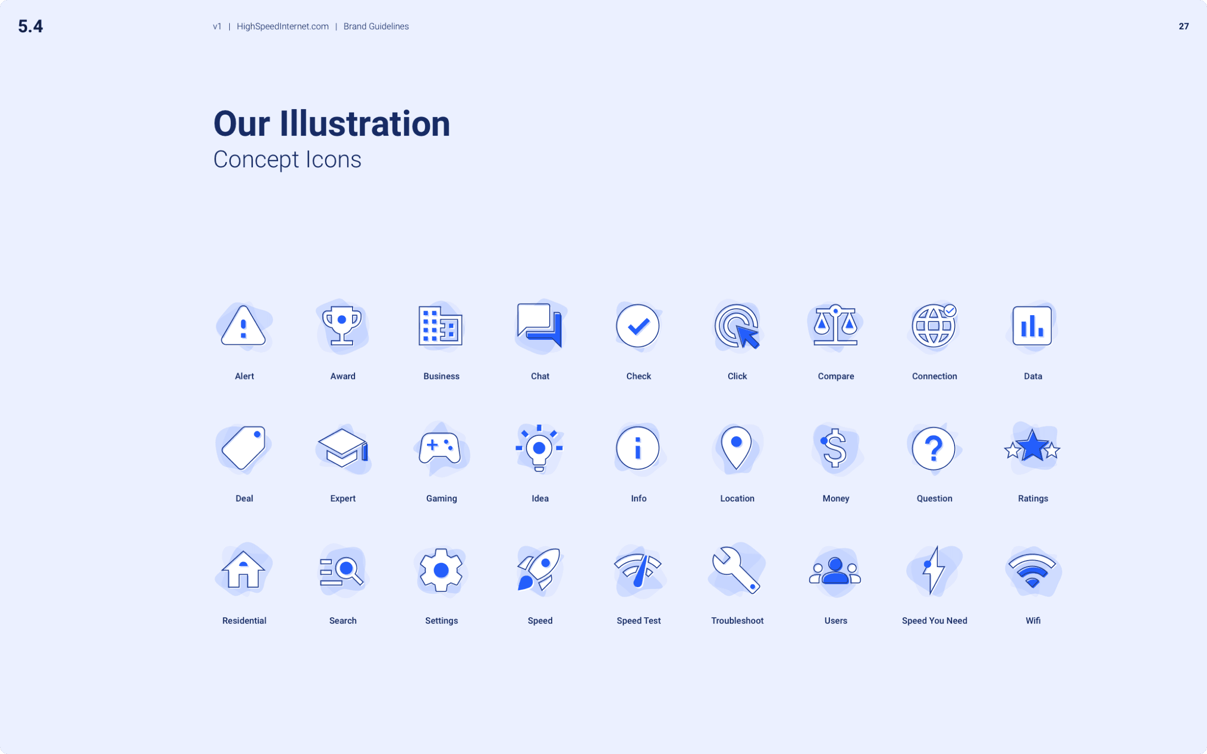
Concept icon library.

New homepage design for Highspeedinternet.com incorporating new identity and brand elements.
Summary
As one of the most profitable brands in the company’s portfolio, this rebranding effort came with increased attention and scrutiny. All along the way, I worked with company leadership, website managers, and other individual contributors to direct and deliver an improved brand identity that achieved a fresh and unique feel for the site. This work helped Highspeedinternet.com maintain its position as a leader in the internet comparison and shopping space.
